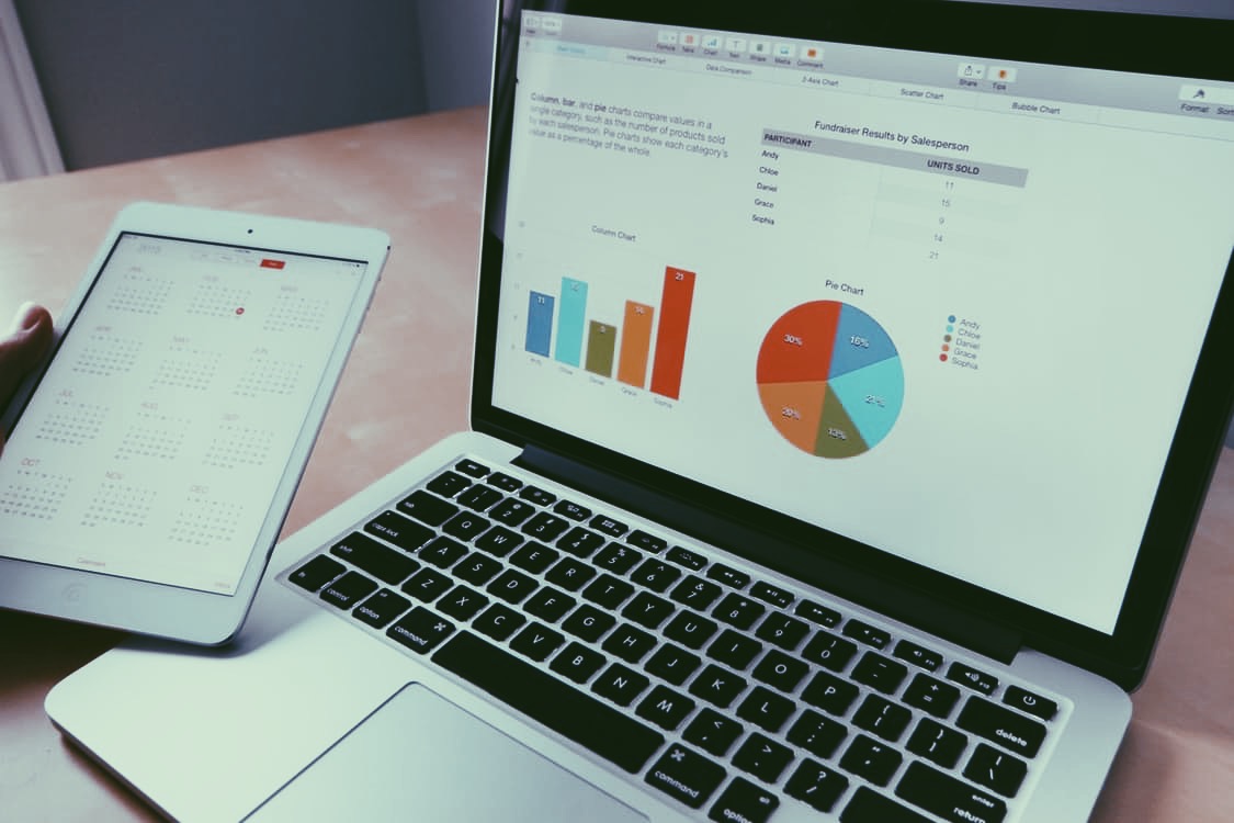
This is the third and final part of our Practical tips series, check out part one and part two, and remember to sign up here to have all of our latest thought on social impact delivered straight to your inbox.
A quick google search for how to make excel charts look more appealing, will churn out a myriad of different articles, all claiming to have definitive answers. The reality, however, is much more nuanced. Much of what looks good boils down to your own individual preference, the kind of audience you’re preparing for and the kind of chart you’re making. In this article we won’t focus too heavily on specifics, rather, we’ll look at a few basic principles to stick to when attempting to make your charts clear and attractive.
Data
First of all it’s vital that you order your data in the way that best suits your work (whether that be chronological, low-high, or any other format) before you create a chart out of your data. It’s also vital that you choose the right kind of chart: no one wants a pie chart with a 34 slices!
Clearly a simple bar graph is easier to understand in this scenario.
Design
You can’t state it enough: less is more! Don’t use too many colours, or it will end up looking like a 9 year old’s IT project. Excel has around 50 different themes that you can play around with, as well as different designs within each one of them. There are disagreements over whether or not you should have gridlines visible in your chart: though most agree that they should, at the very least, be made to somewhat faint.
Aim to use simpler colours rather than different bright, clashing colours.
Text
Make Sure you have a short, sharp title! You can set a title from the layout tab, I’d recommend having the title at the top of the chart so that it’s nice and clear. I'd also recommend having your legend at the bottom of the page, so that your chart looks cleaner, though if you only have one category, there’s no point having a legend: just make sure your title explains what’s going on. It’s important that any text on your axis is never diagonal or vertical: if you want people to actually be able to read what you’ve given them, you have to ensure that it’s horizontal!
If you have lots of text in a chart, often it's much easier to use a bar graph.
Infographics
The fourth way you can improve your charts is by not using them! Excel charts are really functional and helpful for obtaining easily digestible statistics. They aren't however, the most attractive option available to you, they also tend to make your hardest hitting facts (those that help demonstrate your social impact), hide within a big cluster of numbers. Turning the facts and stats you get from Excel into nice infographics can make a social impact report or presentation really come alive. We wrote some tips on how to that it in this post.
Thanks for reading, remember to sign up for regular updates here!


